

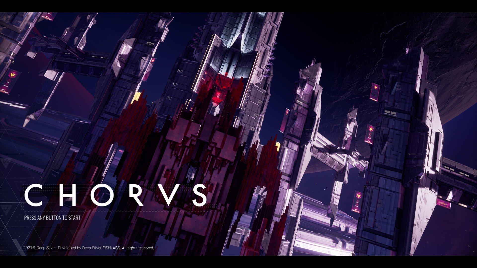
Just like the game itself, working on Chorus was quite the adventure. What began as a quick project to transition the studio away from the mobile games market eventually morphed into the game released earlier this month. A modern day space shooter available day-and-date on nearly every current and next gen platform (sorry Nintendo).
I joined the project team before it was known as Chorus, as it was being spun up, at least several months into prototyping. Fishlabs has been known for their Galaxy on Fire IP, but the jump from mobile to console/PC dev was not straight forward. It was a new engine (UE4), a new team, and a whole lot of ambition. After several false starts and more than a few years of work, it’s great to finally see this game out in the public!
I’ve picked a handful of interface samples from the game to explore in deeper detail… and if you don’t feel like reading at least there are some nice images and videos to look at.
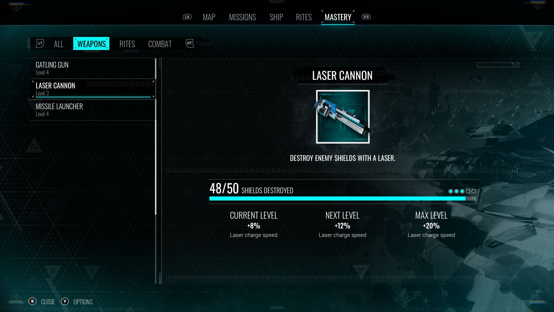
So let’s talk about the Chorus UI. One of the most challenging parts about crafting game interfaces is that the information I really need usually comes towards the end of the pipeline. I might be waiting on several key questions to be answered before I can really sink my teeth into a project. Yes, I knew we were making a sci-fi space game, but aside from that; the mood, tonality and features were a long way off. In the meantime, I was just getting acquainted with Unreal and UMG. I took the time to explore what we could and couldn’t do with the engine. I spent more than a few days collecting references and exploring various interface styles. All whilst working closely with some engineers and tech art to build the foundation of what would become the eventual UI.
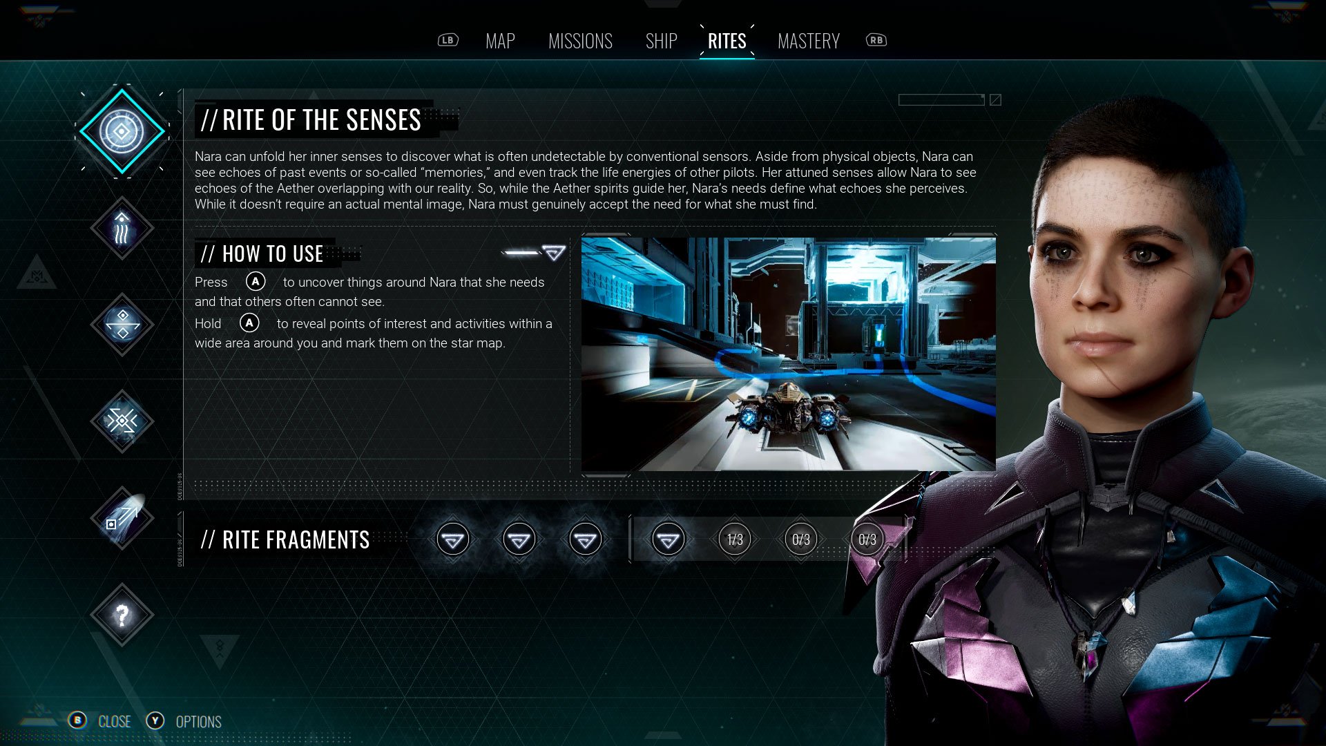
RITES SCREEN
So the Rites screen exemplifies a whole bunch of work and tech that was put into the interface. Here you can see our material post-processing in action: chromatic aberration, glitches, parabola distortion. You can see Nara in high resolution, featured prominently. Video playing in the UI to offer guidance about Nara’s powers. Colored smoke rising from the bottom of the screen thanks to a handy VFX plugin for our UI tool. And of course the basics of the screen; the layout, button design, tab system, typography, etc.
As I mentioned earlier, the tonality of the game was something that we didn’t know at the start. The heavy influence of the “void” and “mystical” overtones of the game didn’t really solidify until much later in development. In response, this is where the interface started to congeal. I pushed it to be a bit darker, more moody. Added the rune language as background elements (triangular elements to fit the existing background) and the more ethereal, smoky quality of the VFX was added to the UI.
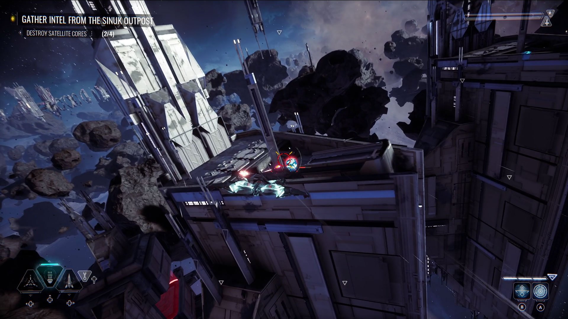
HUD
The HUD was a interesting exercise in trying to remove as much as possible while keeping valuable information and feedback clear to the player. Some of that feedback was diegetic, some directly on the UI. I’m not sure how well we succeeded in this, as at times the amount of info on screen can be overwhelming. That being said, you can see we clearly valued showing the player their weapon info (ammo amount, overheat, weapon type) as it is the most central bit of UI on the HUD. Most other info was seen as secondary and tertiary. What I am quite pleased with is how reactionary the UI is to the player’s movements. It sways with the ship, distorts when boosting, and glitches when shot.
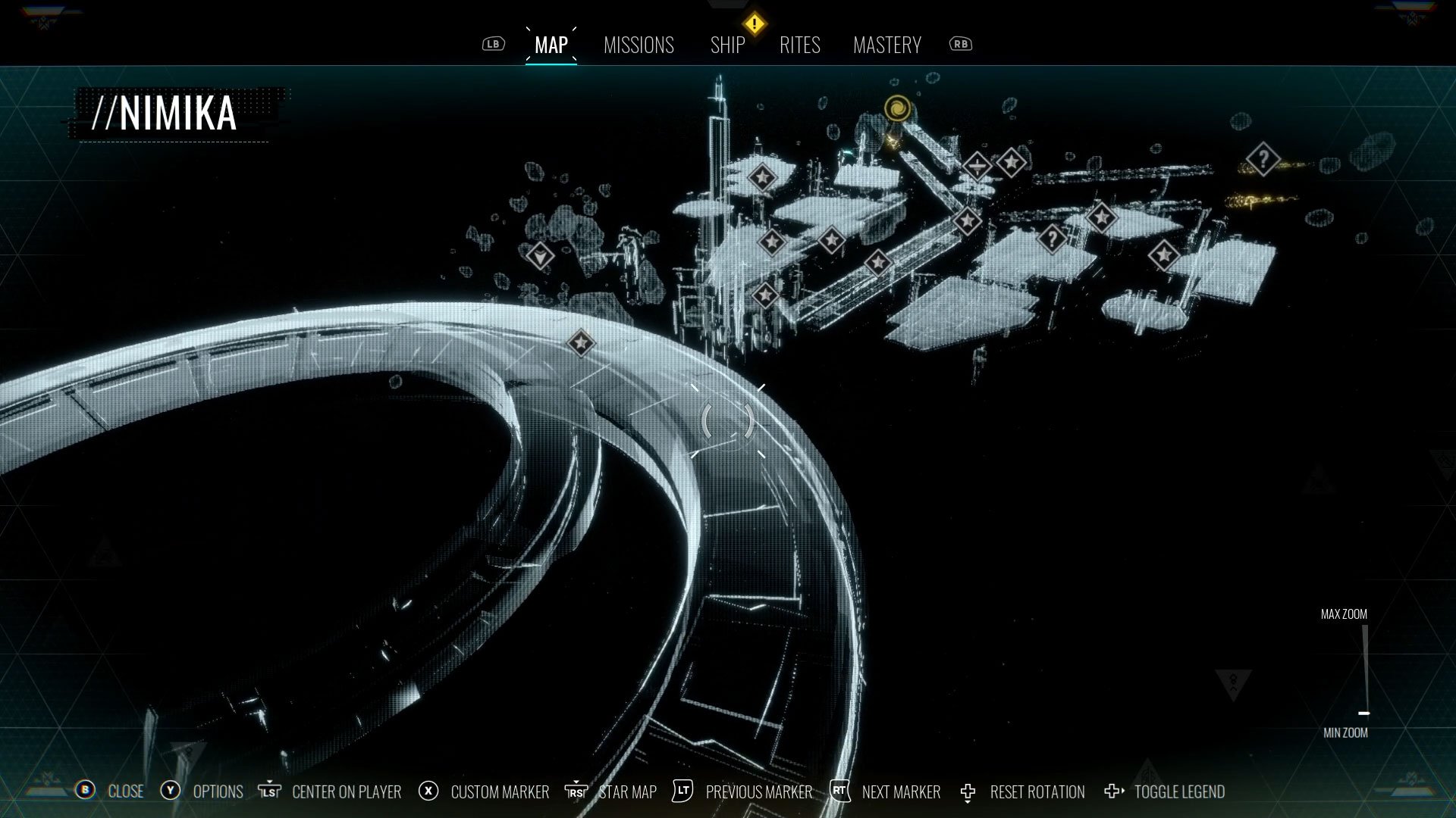
STAR MAP SCREEN
Let me tell you, the map screen was an effort! The team spent more that a few sprints trying to get this right. Let’s talk about some of the issues we needed to overcome workaround.
The logistics of creating a system to always reflect what was in the world
A render-to-texture system that crashed constantly… we were really abusing Unreal
A max resolution of the render that made some of the icons blurry
All things considered, the fact that only a handful of us put this thing together i’m quite pleased with how it turned out. Sure there are some improvements that would have been nice, but that’s for the next project!
SIGNAGE
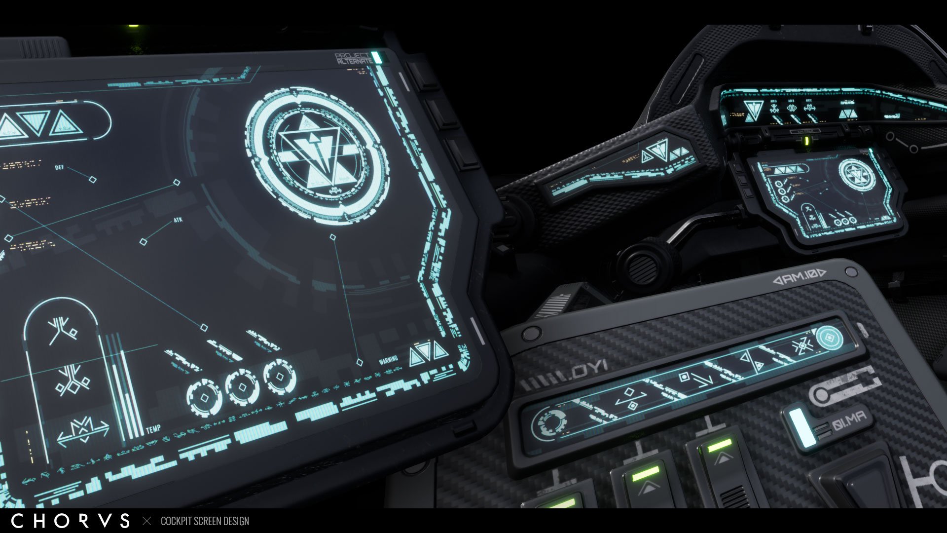
I suppose it’s not bad to mention some of the other stuff I was able to contribute to that falls out of the strictly UI realm. I was tapped to make some of the in-world signage, like you can see above, there is a literal world worth of space to fill. At the top of the post you can also see some cockpit screen designs that I was able to make, which were featured in many of the game’s cut-scenes.
While I was driving many UI topics from a visual and design perspective, I gotta give credit where credit is due. We had a lean, but mean little UI team on Chorus, for the most part hovering around three of us throughout the project. My go-to engineers who were always very patient with me, Paul Evers & Ashwin Sudhir. Lots of tech art support from Alessa Baker. Finally, Phillip Chan in a game design role in the early days of the project and Timm Ruge stepping into UI production on the back half.