Let me paint the picture, it’s January 2021 and Yager has this game called “The Cycle”, but it hasn’t been living up to its full potential nor hitting its KPIs. Because of that, the game is going through a major direction change. It’s set to be completely overhauled with a new vision for the gameplay and art. The game had an existing UI, but it turned out to be super bloated and no one was really happy with it. Oh, and did I mention it had about a 6 month timeframe before the team would like to unveil this new direction with a sizable closed alpha test?
Little did I know this is what I signed up for when I joined the studio last year. I could describe the situation in a handful of ways, but I guess daunting would sum it up well. So, welcome to my year on The Cycle: Frontier. Below is a story of (mostly) success in the face of more than a few headwinds and a project that I am ultimately proud to have contributed to. Don’t worry if you are not the reading type, there are more than a handful of screenshots to look at, just scroll through.
Making a Plan
To provide a little context for those unfamiliar with the game, The Cycle: Frontier as it currently exists is a high stakes PvPvE first-person looter shooter. I had a bunch of things to figure out during my first few weeks on the team, including many decisions to make that would be based on a super short timeline and not a ton of resources at my disposal. In no particular order I had to; perform an audit of the existing interface, define and create a new style guide, understand the ownership of many game features, redefine and develop a new UI workflow for the studio, and that’s just to name a few. This was all happening as myself and the senior UX designer were simultaneously pushing for the creation of a dedicated, full service UX/UI team.
Luckily we had a bit of context as to what we were making, since we could compare many of the game features to the “old” game. This gave me a rough outline to the amount of screens and content we would have to manage in the “new” version of the game. It became clear that the crucial resource that we were working against was going to be time. I went ahead and built a proof of concept directly in the engine in order to show that what I was suggesting would be a feasible way forward. In under a week we had a basic UI up and running based on a component style system. I’m super proud of this, because I believe it was the catalyst that allowed us to move forward from the art, design and tech side of things. You can see an example of it below.
Since the timeframe was so short I knew whatever I came up with would need to be adaptable enough so we could iterate with relative ease in the future. I also knew that we wanted to create a unique sci-fi interface that looks modern, sleek, simple and consistent throughout the game. I latched on to the directive of “serious sci-fi”, but wanted to still have the interface feel approachable and pair nicely with the in-game graphics. I decided to go with the relatively straight forward direction of treating most UI elements with a classic sci-fi 45° angled cut motif. Buttons, headers, backgrounds all utilized this consistent angular shape language which you can find throughout the interface.
The UI was starting to shape up nicely; between the visual explorations being made in-engine and some work in illustrator, we were starting to get a feeling how the UI could come together. The interface could display all sorts of different content while remaining readable and flexible. New fonts were picked that fit the sci fi tone and supported many localization needs. A neutral color palette and treatment was defined, allowing the interface to work in many different situations. And finally, the screen layouts were quickly forming into a system that would work for many game features. The intention was to provide information in an easy to read and understand manner for the most intuitive experience possible.
Quick Wins
At this point I felt comfortable with the direction for the style, convinced of the direction for implementation within the engine, and most importantly I had buy-in from the team.
Our UX designer and myself had been working closely together during this time as he had been fleshing out the latest user flows and wireframes and I was building them in-engine. We used those wireframes to build out the framework for almost the entire UI in a very systematic way. This system would allow us to build new screens and components very quickly for most game features even if they wouldn’t be functional for a few months to come. The process for building out each screen directly in Unreal/UMG was fairly straight forward; we would create any unique graphics needed for the screen, new common elements we needed would built a shared component (like a button or progress bar for example), we setup basic in & out animations, we even did some light blueprinting in the graph where we could. We quickly had a nice library built up that made making most new screens very easy.
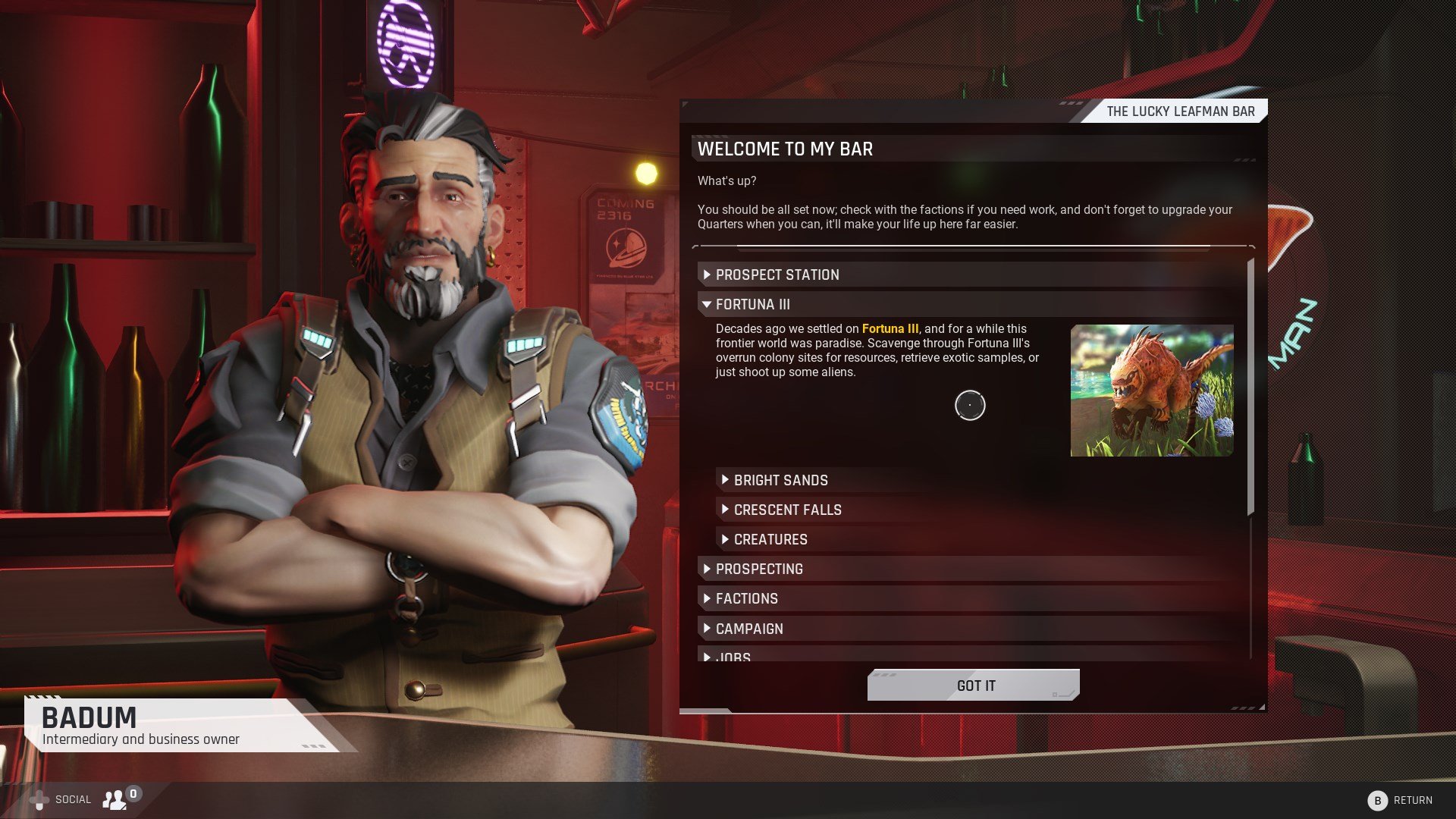
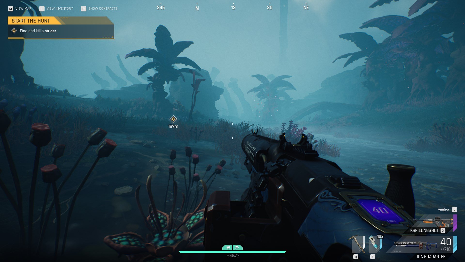
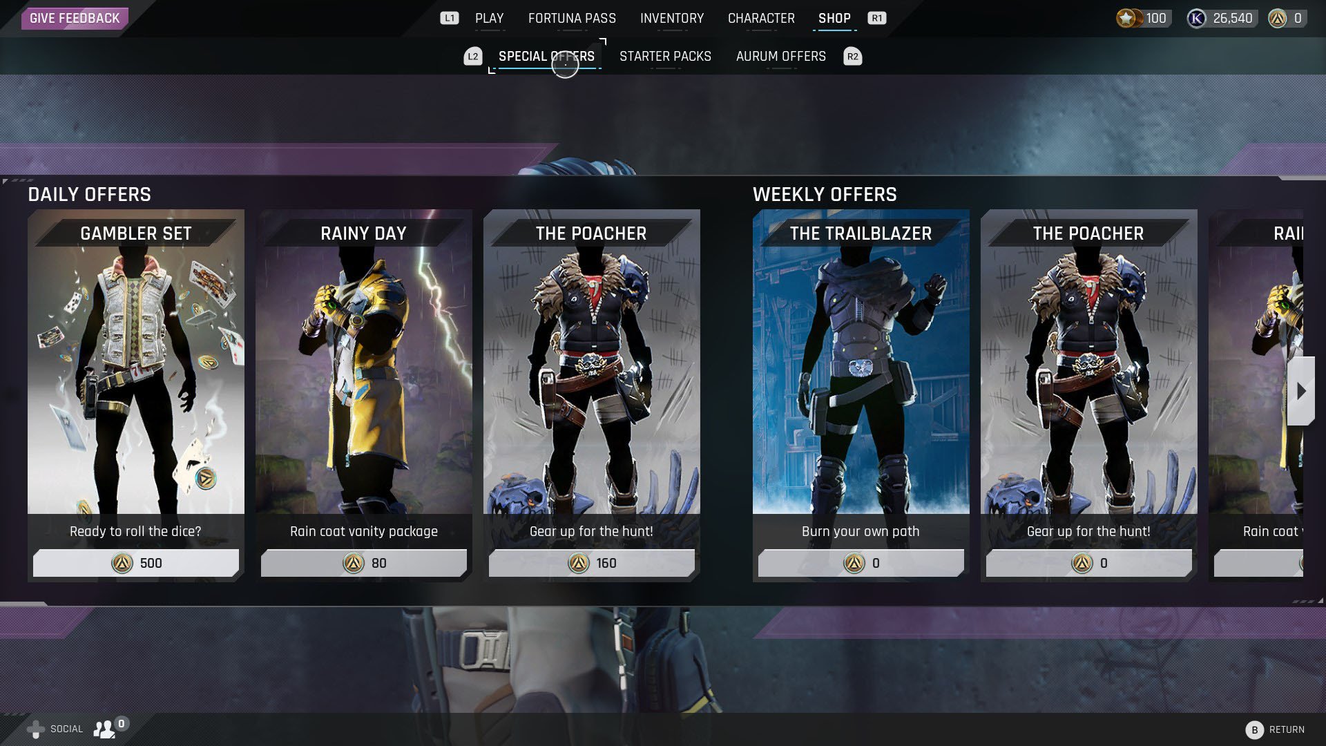
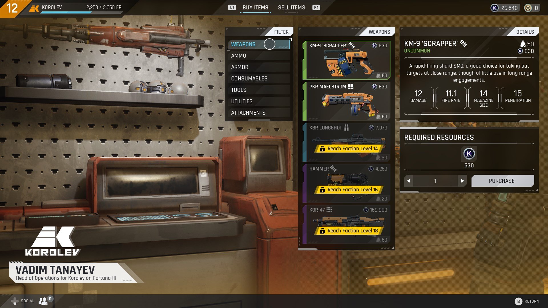
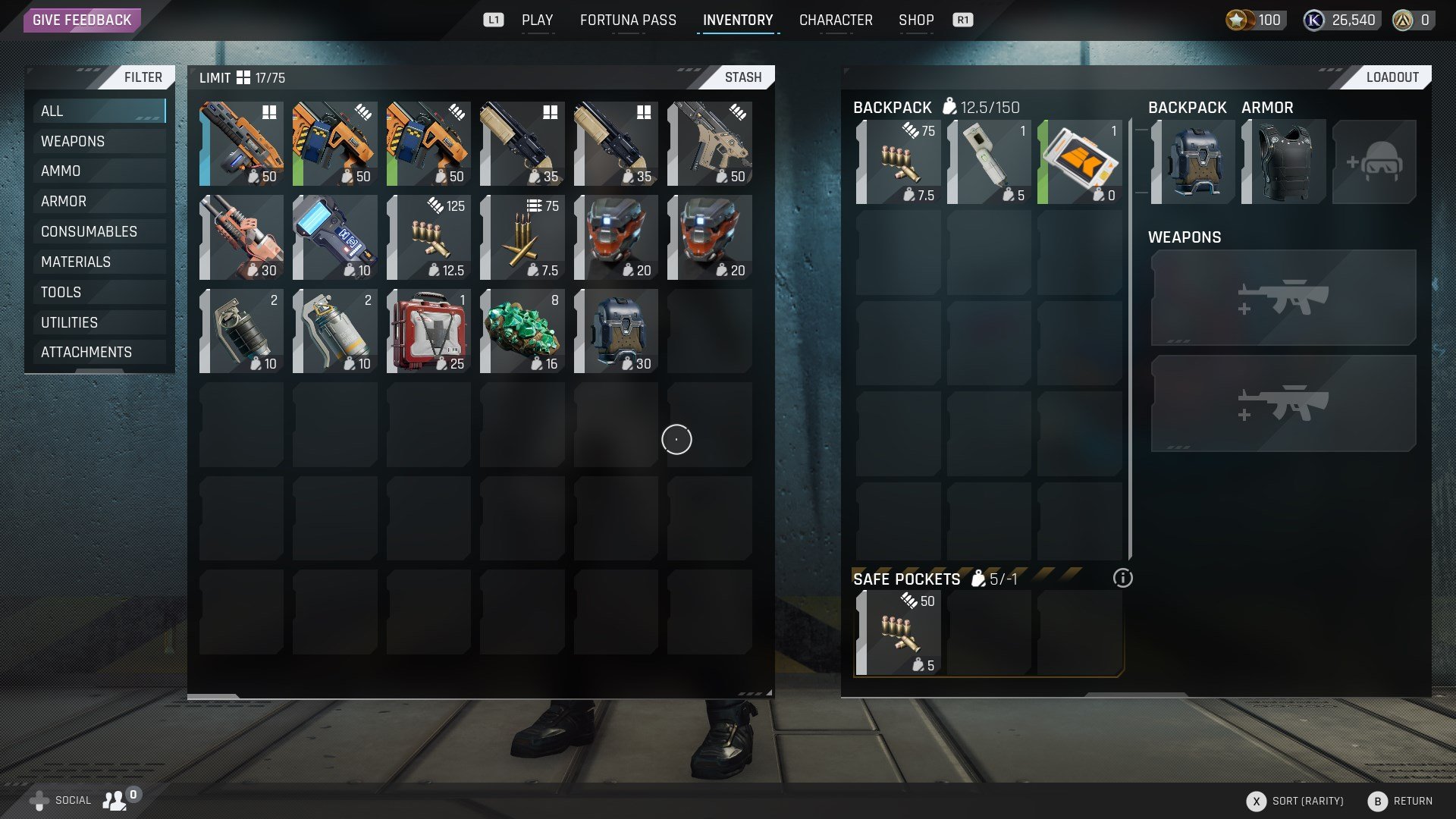
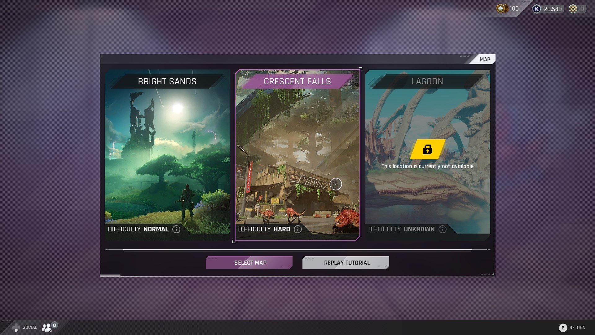
It wasn’t too long before our coders started swapping out much of the old UI. It was at this point that I had the UI designers move onto preparations for new features and allocated time for them to iterate and influence the interface style. Around this time, I transitioned into the next phase of development on the UI… the cleanup of the old game.
Cleanup
We had to contend with all the old UI assets in the project from the old version of the game. This was everything including textures, materials, widget blueprints (WBPs) and a bunch of other miscellaneous stuff. Unfortunately it was a mess that didn’t follow a clear convention. So I started slowly chipping away at the pile, removing deprecated assets by the dozens. As new features were implemented this allowed us to pull out the old content. To put it in perspective, I was able to reduce the amount of WBPs from well over 1000 to about 500. On the texture and material front it was a similar level of savings. Sometimes its hard to get excited about the behind the scenes stuff, but the UI portion of the project is so much more organized and efficient now which should be a great base to support the game for years to come.
Closed Alphas & Betas
Spoiler alert, we made it to our closed alpha… in fact we even progressed to a further, more feature complete closed beta in the Fall of 2021. On the UI side we were able to present a brand new UI to the players which was received positively. While everything was not perfect, we gained a ton of valuable insights by receiving hands on and near real-time feedback from the players. While I hope I’ve built up some decent intuition about creating functional UI, it’s very hard to predict how players will interact and break the things you made until you actually see it in the players hands. It also served helpful to see what were the biggest pain points so we could prioritize fixing those.
The team got the added boost of seeing popular streamers say nice things about the work, like seeing DrDisRespect rate your UI 5 stars.
What didn’t work so well
Clearly it was a pretty busy year for me, but one place where I definitely missed the mark was localization. Unfortunately I made too many assumptions about the previous loca system & process and it caused us a ton of work right before our closed beta. And worse, the results weren’t perfect. Some strings were missed and the occasional text field didn’t have enough space to elegantly fit the translations. Most of this is fixed now, but in hindsight this is something I would put more pressure on earlier in production to have a clear testing and debugging workflow.
Other noteworthy achievements
There are a few other things I’d like to call out before I wrap this thing up.
Occasionally on Monday mornings myself and my very patient coder buddy Tomislav would work on some miscellaneous UI topics that we didn’t plan for in a sprint... creatively we called these rogue Mondays. One of the rogue features that we snuck into the game was an accessibility feature that allows the player change the scale of the entire interface. This is a small feature with a big impact. This was really cool to implement because often when you are on smaller teams it is hard to prioritize these sort of changes. You can flip through the images below to see how the interface scales.
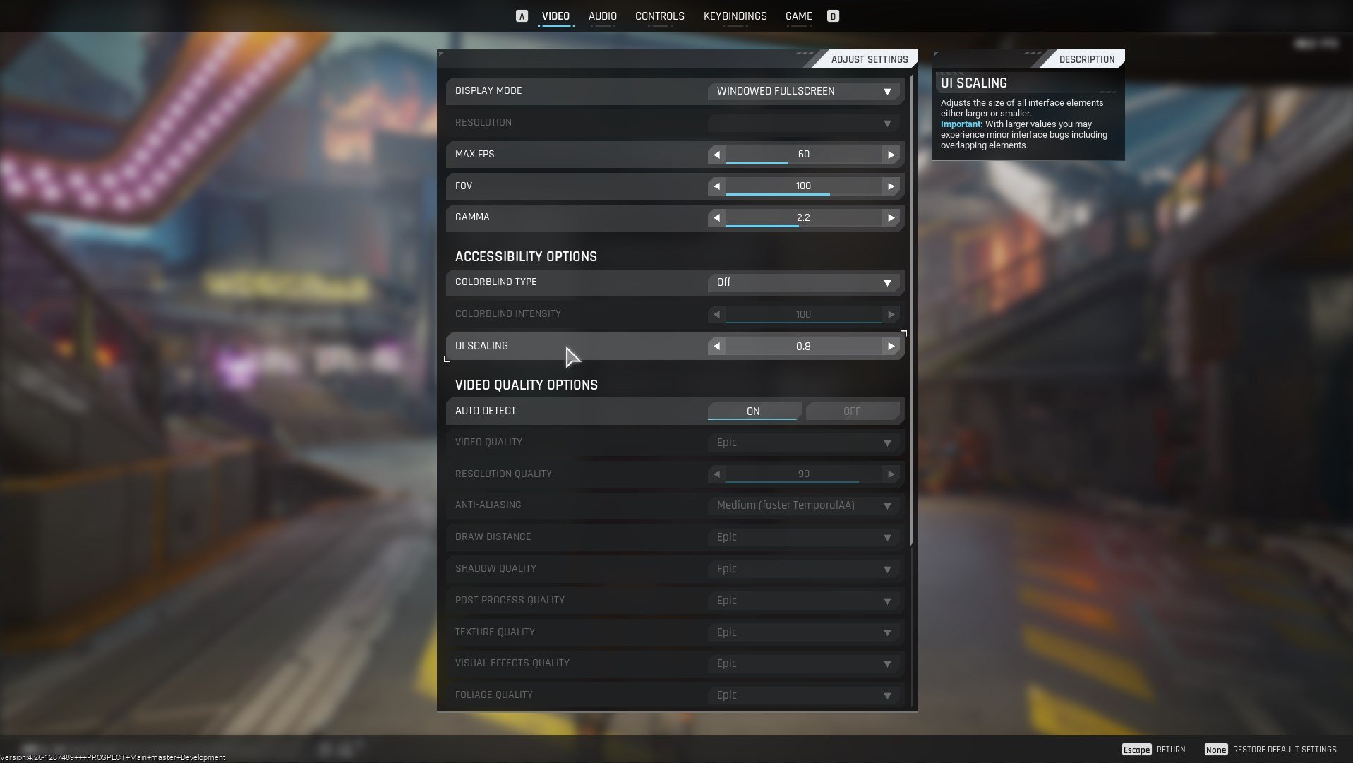
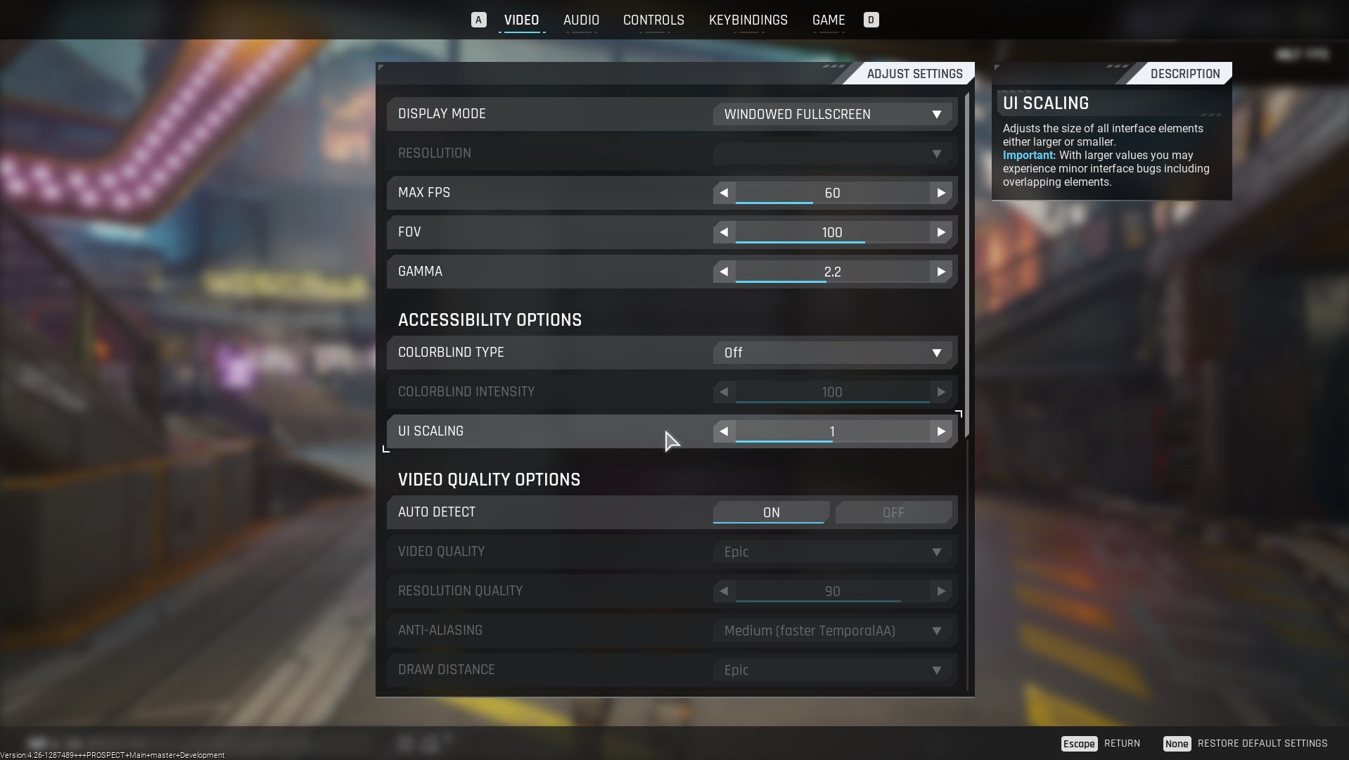
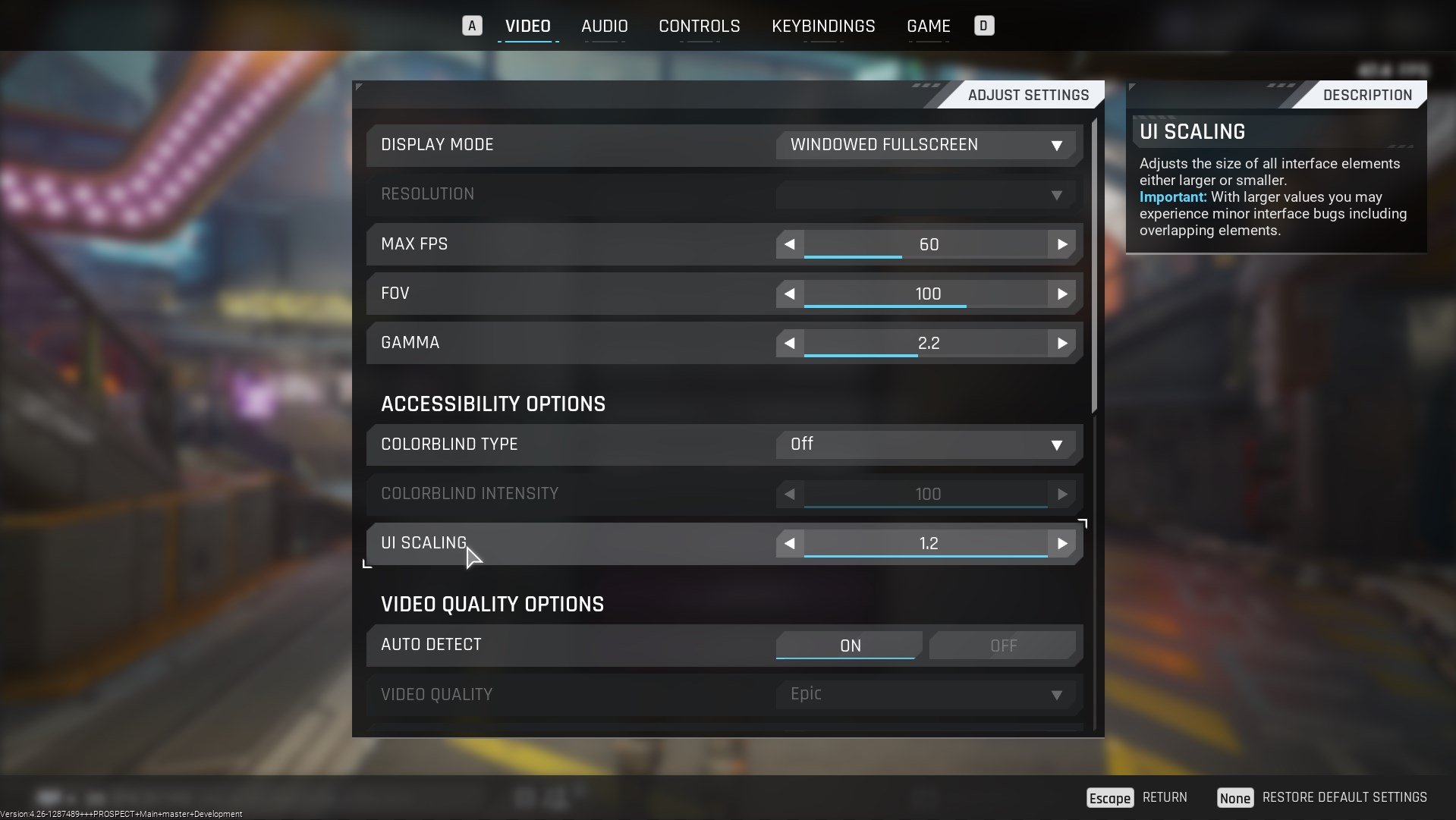
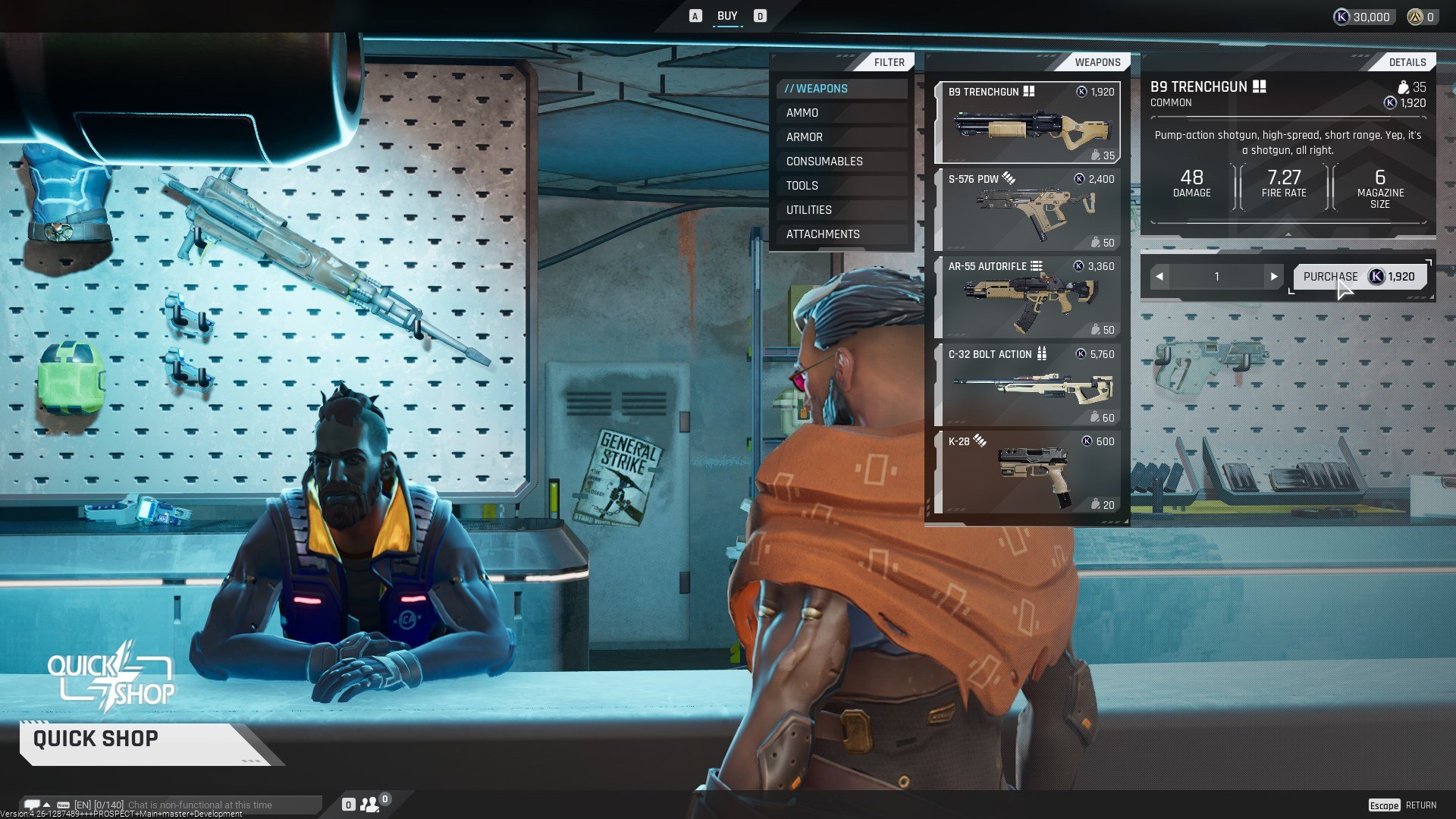
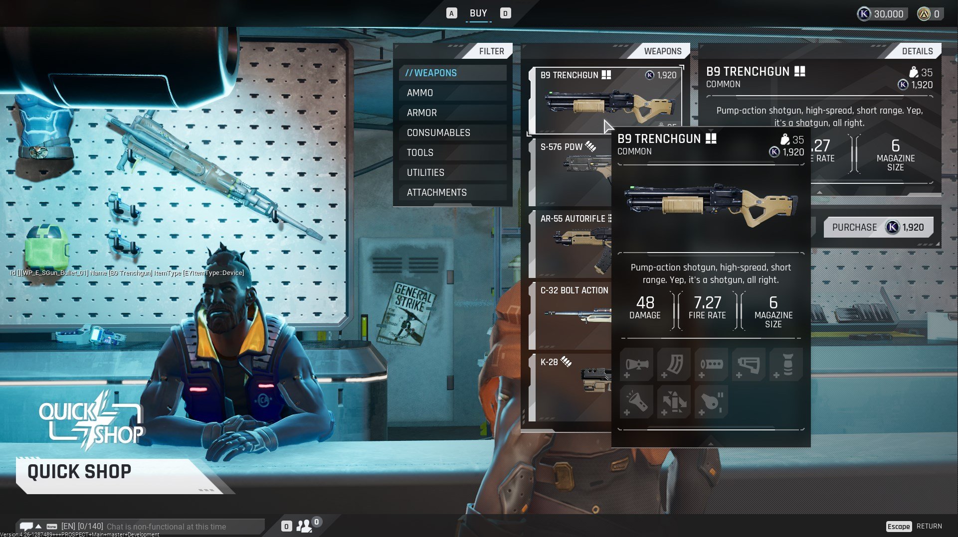
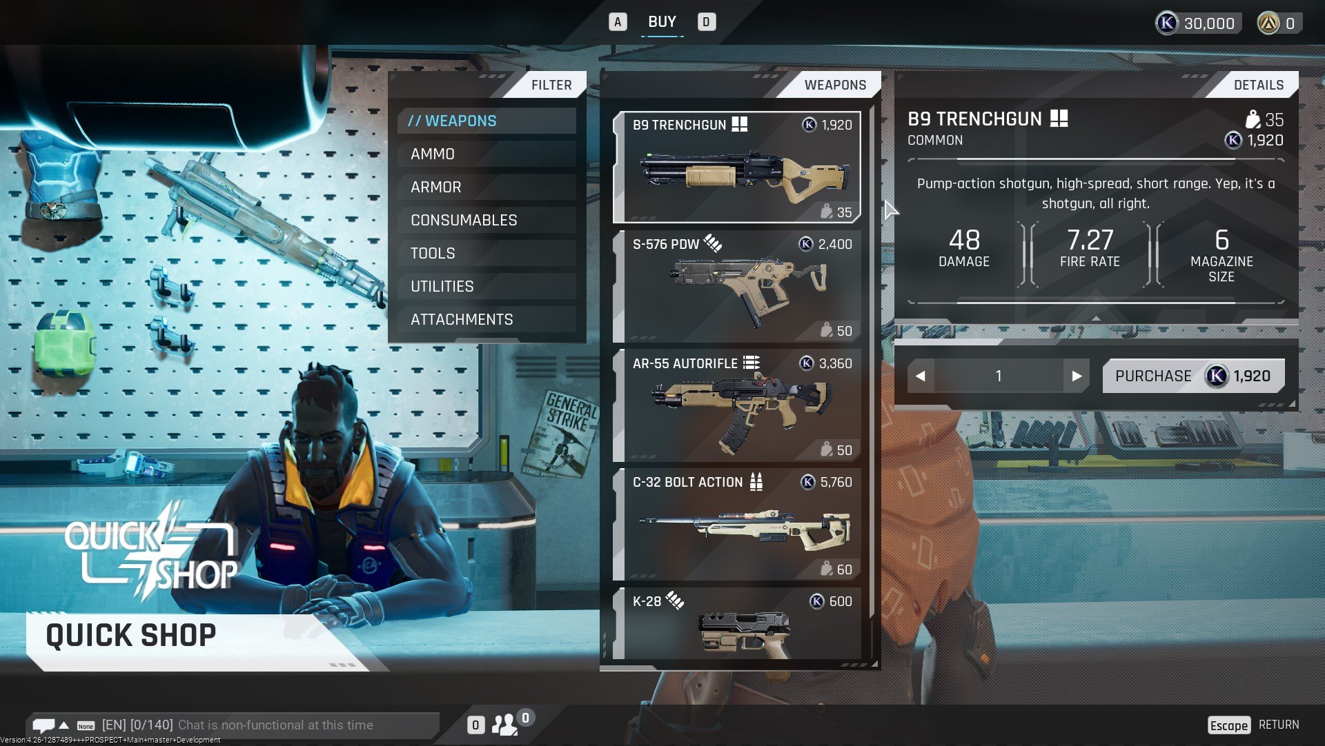
Some other groundwork we started laying but that is not super obvious is preparing the UI to support gamepads. We knew doing native gamepad support would be difficult as many features had previously been designed skewed heavily towards mouse and keyboard. Plus we don’t have the resources to tackle them properly. That being said, when we started the UI rework, we wanted to design it in a way that future controller support is there. For now when you plug in a controller you can observe all the iconography is updated and a virtual cursor displayed on screen. It still needs several quality of life improvements but you can navigate all menus using only a gamepad.
Wrapping up
Right, so that was my time on The Cycle: Frontier. Basically 2021 in a nutshell. A move to Berlin, a new job, avoiding COVID and one of the most productive years work-wise I’ve had since moving to Germany nearly seven years ago. I hope you have had a chance to play it, otherwise the next closed beta should be right around the corner.
Shout out to the small but mighty UX/UI team that I had the pleasure of leading. Their contributions were critical bringing this thing to life.
In no particular order: Krystian was a real workhorse, creating many of the nice animations you can find in the game UI. Corinna rocked it on much of the flat iconography you see. Tomislav facilitated a ton of the engineering effort that went into rebuilding the UI. Insa and Thiago helped usher in some great user experience improvements with their involvement on the game. Sarah and Lea helped keep our features as bug free as possible. Nick and Christian with the huge task of facilitating from the production side. And finally, to everyone else that tangentially helped on the UI efforts, too many to name but certainly appreciated!
As always, thanks for reading!

