
Technically, it's rare that you'll have a project where the sky is the limit. In reality, every project comes with it's own requirements and limitations. Knowing these limitations is the crucial to being able to create games that run well within the boundaries that are set. As you are creating UI, it's important to have these limitations in mind, it's one of the things that separates great UI designers from the good ones.
For obvious reasons, there are many benefits to having a game that runs optimally. Higher frame rates, no frame hitches, and responsive interactions are not things to take for granted. I've outlined some strategies that I use to create performant interfaces. These are written with the Unity engine in mind, but I've also used similar techniques with other engines as well (for example Adobe Flash to Scaleform, Starling, and Adobe Air). So lets have a look!
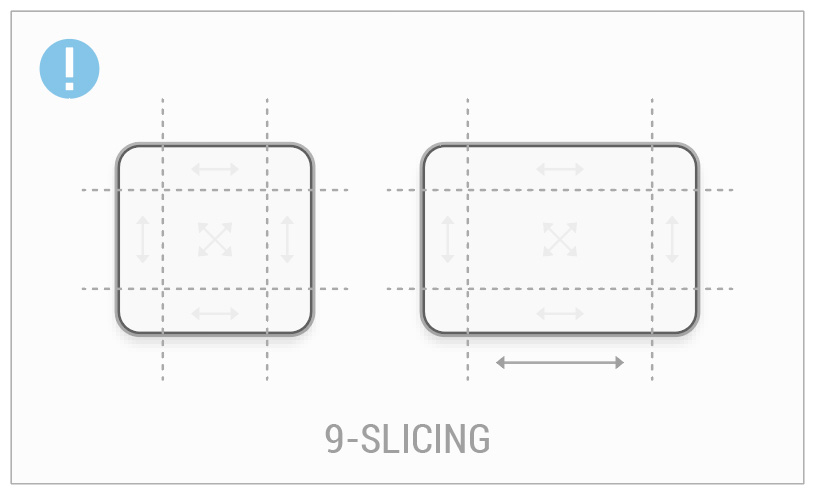
9-Slicing
9-slicing is a technique to stretch images between its corners and center. As its name suggests, this is an image that is "sliced" into 9 different parts. This is very useful for creating different sized elements from the same graphic (like multiple dialogs) while retaining its shape consistency.
Depending on the scope of your game, this can be one of the single most efficient ways to keep your texture sizes low. With a little imagination, you can use 9-slice graphics in many situations. The most common use case may be for dialog "backers", but you could use it to create various color fills for content or maybe in conjunction with a gradient to maintain its consistency. Of course, this doesn't suit all situations, sometimes you can't avoid using large intricate pieces of art, but in many cases I opt for cleverly used 9-slice graphics.
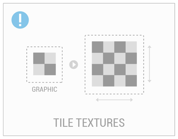
Tileable Textures
Small, "tileable" textures are an efficient way to use repeating patterns (or textures) across a large surface area. The benefit is that the source graphic is much smaller than the surface that it is applied to.
One of the last games I worked on I used this technique to add visual cuts and scratches to a piece of background art. As it was for a mobile game, the screen could change aspect ratio / size depending on the device. Yet even when it did, the tiled fill maintained its shape and dynamically adjusted to the screen.
Tint
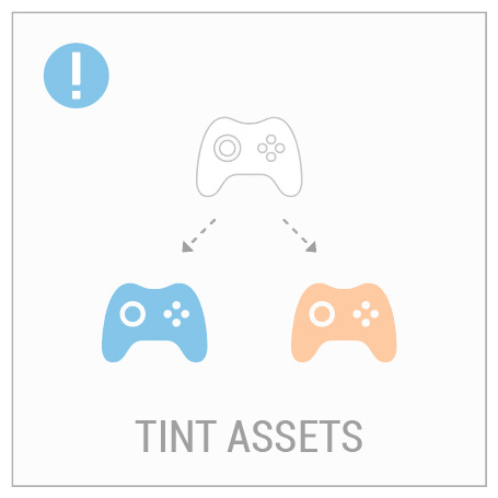
More often than not, you'll need an icon or button that comes in many different colors. You'd be amazed by the milage you can get by simply color tinting graphics. So instead of saving multiple (individually colored) graphics, you can tint a single graphic to get far more variations. For those wondering, this works in a similar way to adding a color multiply in Photoshop.
The example shown to the left displays how a controller icon can be colored to both blue and orange from just one (white) source graphic. As compared to saving out 3 separate textures (a white, blue and orange icon) the benefit is clearly a smaller texture footprint.
Another inherent advantage to constructing art in this way is that it lets you react faster to color change requests. Additionally, it provides the opportunity to programmatically control various graphics color schemes.
Reuse Assets
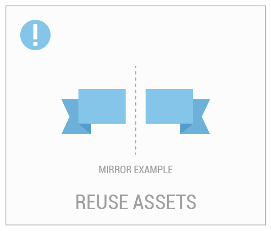
Back in the day (and sometimes now) it was common for 3D character artists to create textures with only half of the face painted. By flipping the UVs on the model, this made the face appear whole again and saved on texture space. We can think about optimizing UI in similar ways.
Explore how you can reuse the current graphics that you have to get the most bang for your buck. Maybe you can flip or rotate an asset in engine instead of saving out a new graphic? Maybe you can use a few small decoration pieces together to make something larger? The possibilities are great.
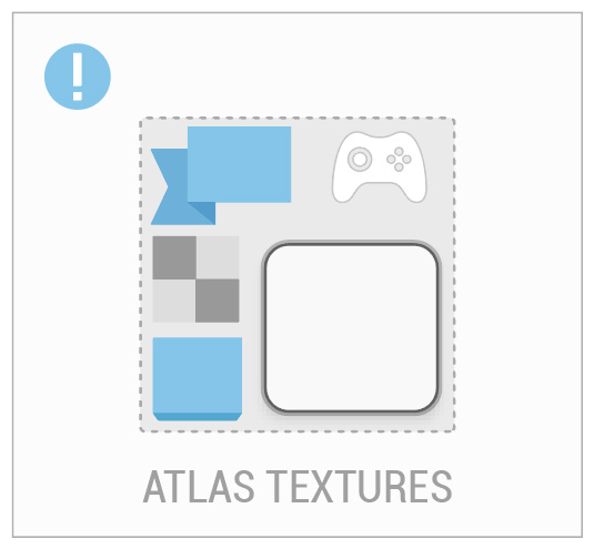
Atlas
Texture atlasing (also referred to as a sprite sheet) is a topic within itself and this article has a great overview. Without getting into too much detail (so again, go read that article), I wanted to briefly touch on the topic as it is one of the single best ways to help game performance.
It usually takes many, many graphics to make a UI. As with any game engine, it takes computing power to find and display each one of those textures. An atlas is a way of organizing your textures onto a single, larger "atlas" texture. It's usually made of two things; a graphic file and a supporting file format that includes the coordinates of all contained textures. This is useful as you can have one file that draws most of your UI. Atlases typically come in the power of two, so as you are creating your UI graphics, keep in mind how your textures might fit together.
Think Cleverly
Making interfaces is all about creative thinking. Now that you know a few ways to create UI graphics optimally, keep these tips in mind as you are creating your art style and assets. By combining techniques like tinting and 9-slicing, you can start finding ways to be more efficient.
General Tips
So, I've given some ways to optimize your UI, but this isn't an exhaustive list. The one point that I want to hammer home is the importance of keeping performance in mind throughout production. Work with your engineers and make an effort to understand the limitations of the engine and platforms you develop for.
- Test performance early and often, testing at later stages is often too late.
- Be aware of platform specific issues, for example images may behave differently between iOS and Android platforms.
- Be aware of overdraw and draw calls, and understand how it can negatively impact performance.
And here's one catch, depending on the hardware and engine you are running on, these tips might not always be relevant. And, if you are using Unity, check out some of their documentation for more ways to optimize UI. Keep in mind that optimizing UI is not a straight forwards process. There is no magic bullet. It requires diligence and perseverance that involves a joint effort between yourself and your team.