At one point or another, as artists, we're presented with the challenge of creating something from nothing. Whether it's a blank piece of paper or a fresh PSD sitting in front of you, It can be the most daunting part of any project! In a previous post, I talked about the broad process of making game interfaces (which was very high level). I'd now like to focus on the visual development side of creating interfaces for a games.
I have a bit of a bias here, but let's just say that UI visuals are hugely important! They are (normally) the first thing players will see and the thing they interact with. And being that an interface is usually the first time thing that people see, it's importance can't be undervalued in setting the game's tone. So with that great responsibility, let's talk about some ways to create UI visuals.
I'll touch on some topics such as; what questions should you be asking before starting, getting those first ideas down on "paper", telling a story through UI, and how to sell your ideas. Of course everyone has their own creative process, but I like to approach things in more of an analytical way, this ensures I'll have all my bases covered at the end of the day. To be clear, I won't be talking in detail about things like color theory or creating balanced compositions (I'm assuming you know this already + there are plenty of resources out there already). Let's go!
Overview
Below is a list of what my creative process looks like. It's broken into 6 key points from the initial info gathering to finalized visual guidance. The idea here is that each item could represent a small milestone in your interface art journey. In the next sections I'll break down each item in further detail.
- Information Gathering
Informed decisions are better than the uninformed. - Reference Gathering & Curation
Assists in getting all stakeholders on the same page. - Visual Exploration
Based on your reference research, visual exploration helps narrow down an eventual look for the UI that ties in with the games fiction. - Tackle Key Visual Topics
Concurrent with the visual exploration, actively define typography, iconography, buttons and so forth. - Refined UI Visuals
Culmination of the learnings from all previous visual explorations into one final vision. - Style Guide
Documentation of all learnings and future guidance to maintain consistency.
Information Gathering
You're going to want as much info as possible before starting your visual development. Key questions need to be asked to have a basic vision and starting point to any project. Here's some good questions to ask (and why):
- What are we making?
This may seem like a dumb question, but you would be surprised by the amount of projects that kick off without having a defined vision. Get the ball rolling by poking and prodding for the details of the game you are going to make. - What are the target platforms (Eg. Mobile, Console, PC and Min Spec)?
This lets you define a couple of things up front, for example: The resolutions you might need to design your graphics at. The view distance that players will interact with your designs. If it's a multitude of platforms, the considerations for how flexible your art style needs to be to adapt to multiple screens. - What is your target demographic?
This can give you some initial starting points for your visual reference research. A demographic of 40+ female is unlikely to have an art style resembling God of War in the same way that a 20+ Male demographic will unlikely want a My Little Pony themed UI. Keep in mind these are broad generalizations. - Any specific business goals?
Maybe your company wants to leverage a certain IP to capture a market segment of a certain genre (lets say casino games). It's good to have this in mind when making certain choices about an art style and how you can utilize this information to sell your art decisions back to various stake holders. - What is the timeframe for production?
As with many creative endeavors, we have to balance delivering high quality art assets under tight deadlines versus having project requirements that might not always align with our own self interests. In this regard, it's wise to make art style decisions that are feasible for the duration of your project. For example, if you have 2 weeks to make a 50 icons, it's likely that you would choose a "flat" style versus a style that is more rich and detailed. - What resources might you have?
It's great to know what resources you can expect on a project. Will you have access to outsourcing? What is the team size? Is there a dedicated UI engineer? All these things can affect choices you make in the planning stage. - Any competitors to research?
Having a competitor list is highly beneficial. You can measure the graphic baseline that competitor products have set, make choices about differentiating your product, and observe how they have tackled existing problems. - Any previous market research or insights?
Again, the more information you have at your disposal is key to making informed decisions. For example, maybe your marketing department or UX research can tell you what sort of art style is resonating in a specific genre?
Reference Gathering & Curation
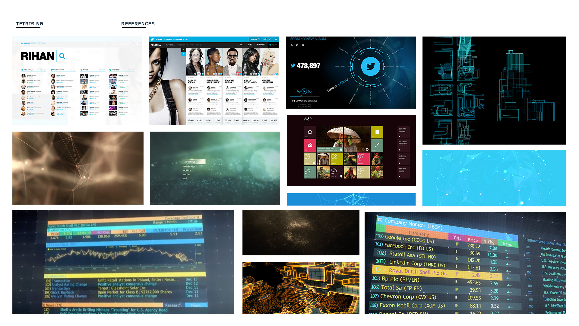
Before doing any project, I always begin by collecting visual reference. More likely than not, there is a game (or other media) out there that has addressed some of the same problems that you are working on. If anything, the inspiration gained from looking at good (and bad) design is invaluable. Additionally, I like to look at sites like Dribble, Pinterest, and Art Station for daily inspiration. You never know how you might connect the dots to make something new.
After collecting a whole bunch of art, I'll sift through it all to find pieces that I feel work particularly well. I'll organize them onto a reference board that serves as a talking point to help sell a certain vision for the game. I find that having these sort of documents are invaluable when talking to non-artists to assist in creating an idea or mood.
Visual Exploration
With all the information that you now have, it's about time to make some art! There's a saying about throwing spaghetti against the wall to see what sticks, for me, same goes for when I'm creating UI. This is when I'm experimenting, trying out ideas, and looking for visual solutions that will connect to the game's fiction. I'm usually bouncing between doodles in my notebook and Photoshop / Illustrator.
I'll look at what style to pursue. For example, does a more physical interface make sense or maybe a flat UI or something in between? How I approach these topics might vary. I might start with a header graphic and make a few iterations of it, trying different type and color treatments. Or maybe I'll make a few buttons in differing styles. With these visual explorations, I'm hoping to find something that resonates with me.
Once I find something that I think might be working, I'll expand that idea to a whole screen. By doing this, I'm seeing how different color schemes, buttons, type and icons will work together. Also, don't forget about the in-game visuals (like the game world, backgrounds). I like to drop in concepts of in-game art to get a feel how the interface and game are working together.
If it's not clear by now, the intention of the visual exploration is to find an interface style that will be suitable to the game I'm working on. Each exploration gives a better sense at what the style will look like; the color palette, typography, and supporting assets take shape. It might not be immediate, but over time the explorations should be revealing a more clearer path to follow. And by continually getting feedback from fellow artists, this helps push the best ideas forward.
A few other thoughts to keep in mind:
- Be aware of time restraints, resources to work with, and any other info that you gained from the "info gathering" step. This usually has a direct impact on the style I choose.
- Make mental notes about how to achieve the visuals inside of a game engine, this will help you out down the road and keep some of your more extravagant designs in check.
- Communicate with your peers (across all departments), you never know where a great idea may come from.
Tackle Key Visual Topics
Aside from making sure you are creating something that is visually pleasing, there are a few key items that need to be specifically thought about. The reason to give these topics a bit more attention is because of how they might affect development in the future.
- Typography definition and usage
From localization to licensing, there are many ways typography can be a tricky topic for games. Localization can be a huge time sink if not planned correctly. For example, does the font you picked support all the needed localization needs (like proper language glyphs)? Are you prepared to license that nice font you found? It's also nice to choose a "hero" font and a font for body copy. I will definitely write a proper post about text and localization best practices in the future, so stay tuned! - Iconography definition and usage
Creating a library of icons can be a huge undertaking, especially depending on the style and production methods you decide to use. Take extra care here that you know all the icon requirements (eg. how many) for your game before committing to a certain style.
- Button definition and usage
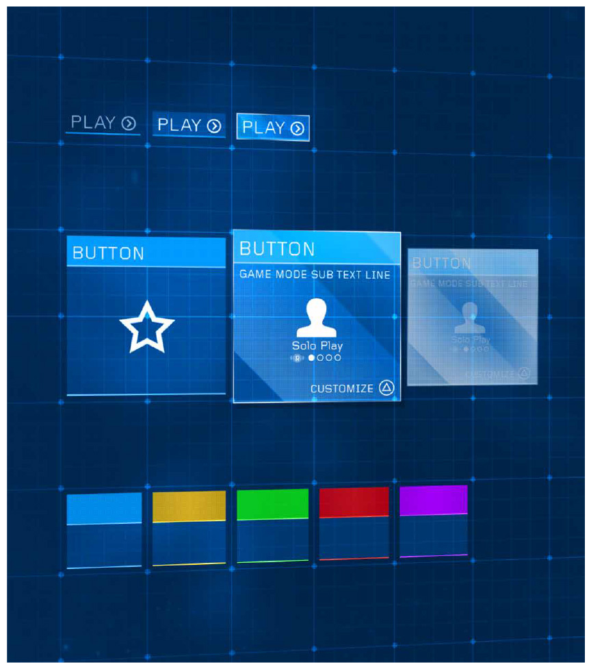
Especially for mobile games, it's good to think about how you might create a library of buttons that are both efficient and achieve all UX needs. You need clear visual language here and buttons with a range to achieve that (multiple colors, states, etc). Spend some time thinking about what the various highlight and pushed states might look like. And lastly how you might make those buttons in an efficient way (9-slicing, color tinting). - Color palette and usage
Similar to the button definition, think about how color might be used across your interface system to create clear messaging for the player. Maybe there is a color that is only associated to positive events or certain colors that are reserved for in game factions. - Screen Systems
As you are creating various visual mockups, pay attention to elements that might be able to reoccur within the interface. For example, there is a checker pattern that works great in a certain dialog, is there anywhere else you could reuse it?
Refined UI Visuals
This is where I combine all the learnings of the previous visual explorations into a more "final" UI solution. The best way that I go about doing this is by creating 2 to 5 representative screen mockups with the intended UI style. I suggest using the HUD, a standard popup, and a screen with medium complexity (tabs, scroll lists, buttons, panels, etc) to achieve this.
By making those screens, you can ensure that the chosen style is flexible enough to support standard UI requirements and should work throughout the creation of the game. As UI designers, we're creating a system, and it's best to see it working together earlier than later to identify potential problem areas.
One small side note. I wrote "final" in quotes - why? Well, nothing is really final in games now-a-days. Even though we have the best intentions, we may modify or find better ways of implementing our art solutions when we're actually in production and even in live operations. So just keep this in mind.
To get a final blessing, I will usually create a PDF pitch that breaks down some of my interface choices to help sell the ideas to whomever the stakeholders might be. This is usually through visuals, written text and sometimes small animations or animatics.
Style Guide
In an effort to maintain visual consistency, studios will often use a style guide to achieve this. It's super helpful when working with multiple people, an art director, or other studios to ensure future UI designs maintain the same cohesiveness that is outlined from the beginning of production. I suggest documenting several topics (yes, this list look similar to the key visual topics):
- Overview
Describe the high level visual design and the tone that you are trying to achieve. Mention how this works with the fiction of the game. - Colors
Discuss the color palette for the interface, give usage examples. - Iconography
Define stroke weights, perspective, colors, lighting, and give usage examples. - Buttons
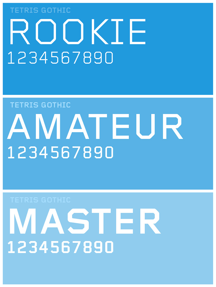
Show sizes, color, states (over, normal, pressed, disabled) and give usage examples. - Typography
Show your typography choices, include sizes, color, and give usage examples. - Shape Language
Is your interface hard and blocky? Or maybe soft and round? Here is the place to define that. As always, show some key usage examples. - Spacing
Have you come up with spacing requirements? Show examples for padding, margins, etc. - Source Paths
Be extra nice and tell people where they can find source asset artwork.
Sample Pages from the Tetris Ultimate Style Guide
Wrapping Up
So there you have it! Thanks for staying with me till now. I'd like to finish by offering some final thoughts on visual development. Interface creation for games is a bit unique in that in touches so many areas of game development. Other artists, game designers, engineers, and so forth usually need to work together to bring a certain vision to life (thats the magic of games).
So when you are creating visuals that certainly have an impact on so many others professions (and a direct impact on the consumer), it goes a long way to be thoughtful about how your choices may affect others. It's a balancing act of creating beautiful art, that also runs well and informs players of critical information. It's no small feat! So be well informed, make great art, and work together to create great things.
*Obligatory Disclaimer - All imagry used belongs to its respective copyright holder(s)


