I'm excited to finally share another project I’ve been working on sporadically over the past year or so. What started innocently enough as an HR request to update the company website back in January 2018 eventually turned into a full blown brand identity update for Deep Silver Fishlabs (Fishlabs for short). Below is a short recap of the journey, and hey, if you are too lazy to read, there are also images! ;)
As with any design project, it’s worth having a bit of context. In 2017, Fishlabs had gone through a transition period from being a mobile focused game studio to a full-fledged console studio. And thus with this website update request, it was the perfect time to reassess the company branding to better align with the direction of the studio and the type of developers we want to attract. Additionally, Fishlabs had never really rebranded itself after joining the Deep Silver family, so we thought this would be a great opportunity to look at how that could be incorporated better.
So yeah, back to the website redesign… this is what we were starting with:
You could say the old Fishlabs website was showing its age. The color scheme was casual and all over the place, the layout wasn’t working so well, and I personally was really not a fan of the two logos (Fishlabs and Deep Silver) smushed into one treatment. So off I went, down the path of the website redesign, all the while doodling some new logo treatments, looking at competitor branding, thinking about new color schemes, tone and of course taking the wishes of management into account. Oh and let’s keep in mind that typically my day-to-day job is usually creating game interfaces, so needless to say I bounced around a bit.
The old logo had some issues with its line weights at various sizes and that’s something in particular I was keen to improve. We made a whole bunch of explorations and probably 6 to 9 months went by with on-again off-again work on the branding, but things were finally starting to coalesce late in 2018. I got my design partner in crime, Timm Ruge, involved at some point and we started defining branding rulesets, getting approvals and slowly preparing all necessary assets.
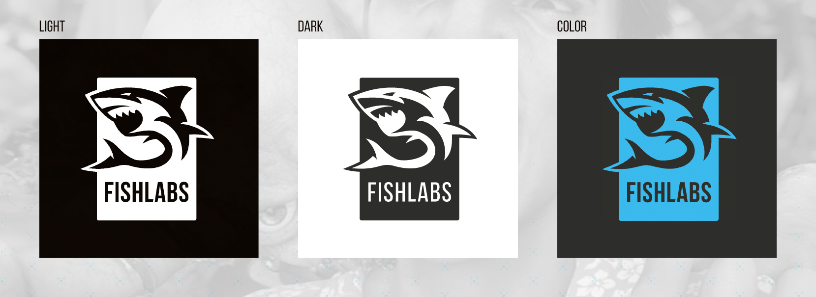
After hearing the many different opinions on the logo we chose to go with the shark motif (which yes, a shark is a fish). There was the wish to get away from the… let’s say… playfulness of the previous angler fish used in the logo and move to a more serious posturing in our branding. Of course a brand is bigger than just a logo and we took the wish for a more serious image to heart. We chose a fairly mature color scheme (dark tones with pops of bright blue). We picked some key imagery that expressed where we are headed as a studio and chose typography that reflects a serious tone and can be used in a consistent manner.
Timm came up with a great square / thirds ruleset for integrating many of our design assets (shown below). This makes it fairly easy to quickly create new graphics that follow our branding. Another great idea of his was to use powerpoint as a way for HR to author job ads (below) and other various media… which saves us the headache of needing to make small changes to the design :D.
And finally, rounding out the new branding, are a few elements we can use all over the place. We’ve created a blue banner graphic which is a recurring element that uses shapes from the logo to emulate the feeling of water. Some great repeating patterns of our logo mark and more.
Overall I hope many can agree that its a nice step forward for the company. It was especially a good change of pace for me from my normal daily tasks. And while there was a lot of crossover skillset on the surface level, there were a bunch of new things to think about for the company rebranding that I normally don’t need to take care of. You can see some more of the work we made here on the website - http://www.dsfishlabs.com/
And of course this is a good point to remind anyone still reading to check out the latest jobs, Deep Silver Fishlabs is hiring!
Oh and lastly, some legal stuff… all Deep Silver Fishlabs logo marks, assets, etc, belong to Koch Media GmbH. You can find more info, including our style guide here: http://logo.deepsilver.com/ - Thanks for reading!

