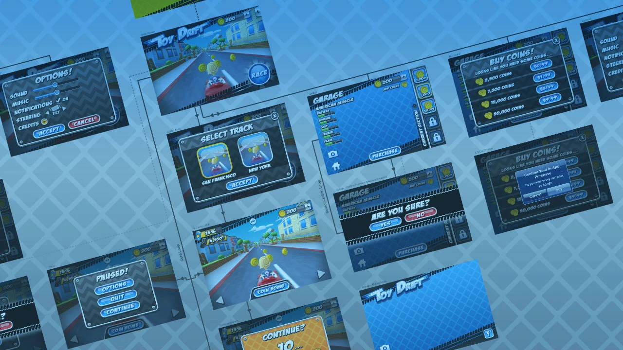
When tackling complex interface projects (such as creating games :D ), it's useful to visualize the information that is needed. Before making anything pretty, two methods to help visualize and communicate this information are user flows and wireframes.
I'll use some examples from a game I worked on called ToyDrift. It is not too big of a project, yet big enough to give you a good insight to a medium sized game.
Overview
Let's briefly define what a user flow and wireframe is, then take a look at some examples:
- User Flow
Organizes information in a way to show the potential (interface) paths that a user (or player) can travel throughout a game. Or said in another way, the user flow gives you a high level overview of the UI screens and players path needed within a game. - Wireframe
So what is a wireframe? Think of it as your blueprint to an individual screen, a visual guide that represents the skeletal framework of a game interface. Wikipedia has a solid overview about website wireframes. Typically, the art in a wireframe is minimal as to not bias anyone reviewing them.
User Flow (Basic)
One of the first things I like to build when starting a new project is the user flow. Working closely with the Game Designers, we'll identify all key screens, the core loop and any other pertinent info to map out what the game may contain. This is super useful in giving me an overview of the project and what I can expect for UI requirements.
Basic User Flow - Highlights key UI elements needed
User Flow + Wireframes (Advanced)
Basic Wireframe for the Options Screen
As the requirements for each screen becomes solidified, I'll start to build out wireframes for each of them. This allows me to identify reocurring elements, interface patterns, and so on. Additionally, I will integrate these wireframe screens into the user flow to see how everything is working together. Keep in mind I am not doing this all at once. Game Designers will need some time to solidify game features, thus I'll only take on 1 or 2 screens at a time as they are ready (it's not like I will create every single screen at once).
A "Sexier" User Flow With High Fidelity Wireframes
User Flow + Art (Longterm)
Eventually, as the production is progressing, I'll start integrating skinned (visually treated) screens to the user flow. You can really get a good idea of the overall picture of the game by this point.
A User Flow Populated with Treated Artwork
Wrapping Up
Here are a fews tips: Print out your user flow and put on a wall. It's great way to have the whole team get on the same page. I've found it invaluable to be able to walk up and use it as a visual aid when discussing problems and solutions. Additionally, expect your user flows and wireframes to change. Maybe your prototype highlights an area that needs to be improved or maybe there is a game design change. Just know that these are living documents.
I'd also like to mention why I specifically find value in creating these documents. I believe that having first hand information when building the user flow gives me more intimate knowledge of the interface that I'll be creating. I also find that the visual design can be impacted quite a bit by the layout of the wireframes, so by designing the wireframes yourself (as opposed to UX or game design), you'll have more control of the overall design.
So there you have it, a quick overview of user flows and wireframes. As always, I hope this has been useful!

